Hunter’s Moon: A Sovereign Syndicate Adventure Now Available on Steam and GOG
Hunter’s Moon: A Sovereign Syndicate Adventure is now available for PC on Steam and GOG.
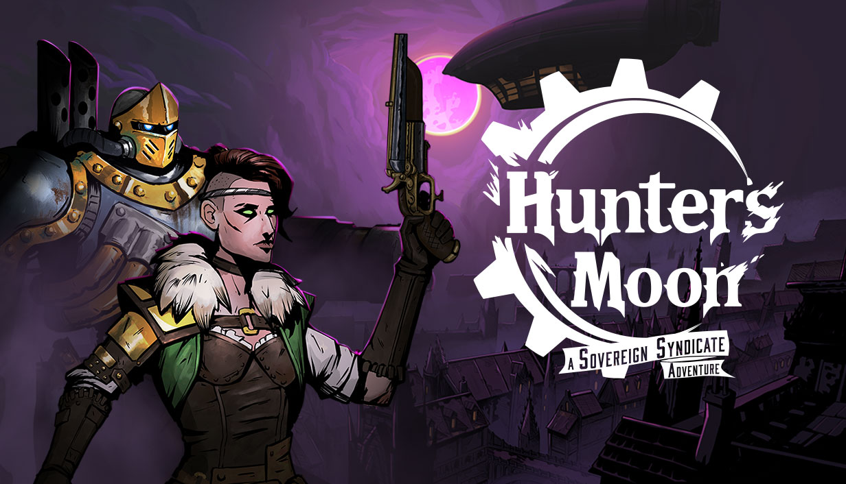
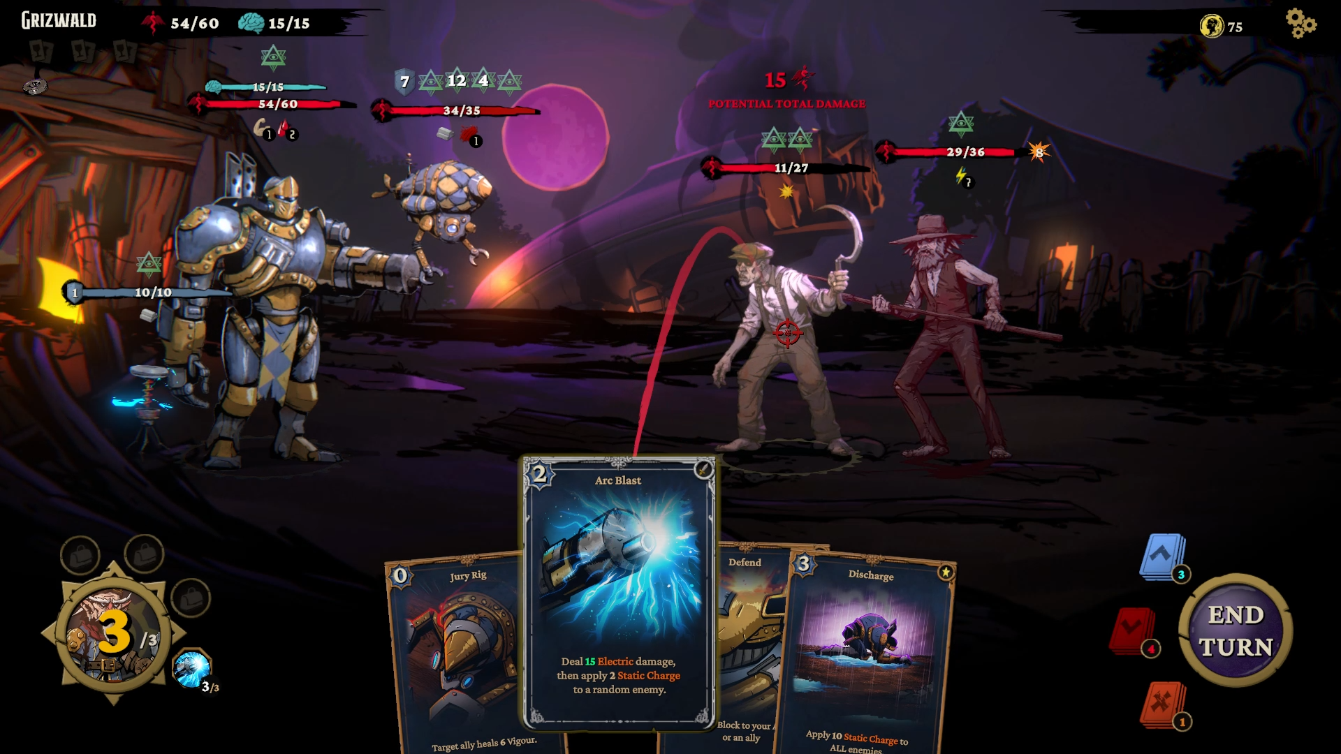
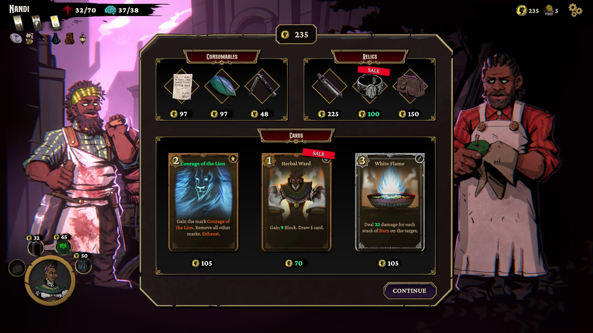
Developed by Crimson Herring Studios and published by Zugalu Entertainment, Hunter’s Moon: A Sovereign Syndicate Adventure is a Victorian Steampunk Roguelike Deckbuilder set in the world of Sovereign Syndicate before the events of the first game. You choose from four characters with unique cards and abilities, customize your deck and character as you investigate a mysterious plague, and battle corrupted beasts and bosses in turn-based combat to unlock powerful relics and enchanted tarot cards. You’ll see some familiar faces, meet some new ones, and get to know more about the history of the Sovereign Syndicate and the world they call home.
Product Information:
Release Date: November 24, 2025
Price: $19.99 USD, Steam Regional Pricing Adjustments, 10% Launch Discount
Steam: Steam Store Link
Target Platforms: PC, Xbox Series X and S, Playstation 5, Nintendo Switch 2
Launch Trailer: https://www.youtube.com/watch?v=t_APdn5tTJs
Press Kit: Press Kit Dropbox Link
Website: https://zugalu.com/our-games/hunters-moon/
Features:
A Victorian Steampunk Fantasy Roguelike: A steampunk fantasy world awaits; filled with all manner of fell beasts and monstrosities. Something isn’t right here, the natural wildlife has been corrupted by a mysterious plague, and it’s up to you to discover the truth and find the cure; but no two runs are the same.
Rich Narrative Adventure: Return to the world of Sovereign Syndicate, before the events of the first game. Explore chilling encounters and complete missions as your agents investigate the Hunter’s Moon. Experience new locations, enemies and bosses across 4 chapters.
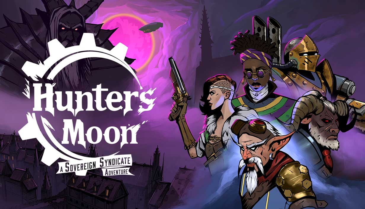
Four Unique Classes: How will you meet your challenges? A hulking brute that smashes everything in their path? A cunning soldier with weapons expertise? An alchemist with potions, poisons, and explosives? Choose your agent and build a deck that suits your playstyle.
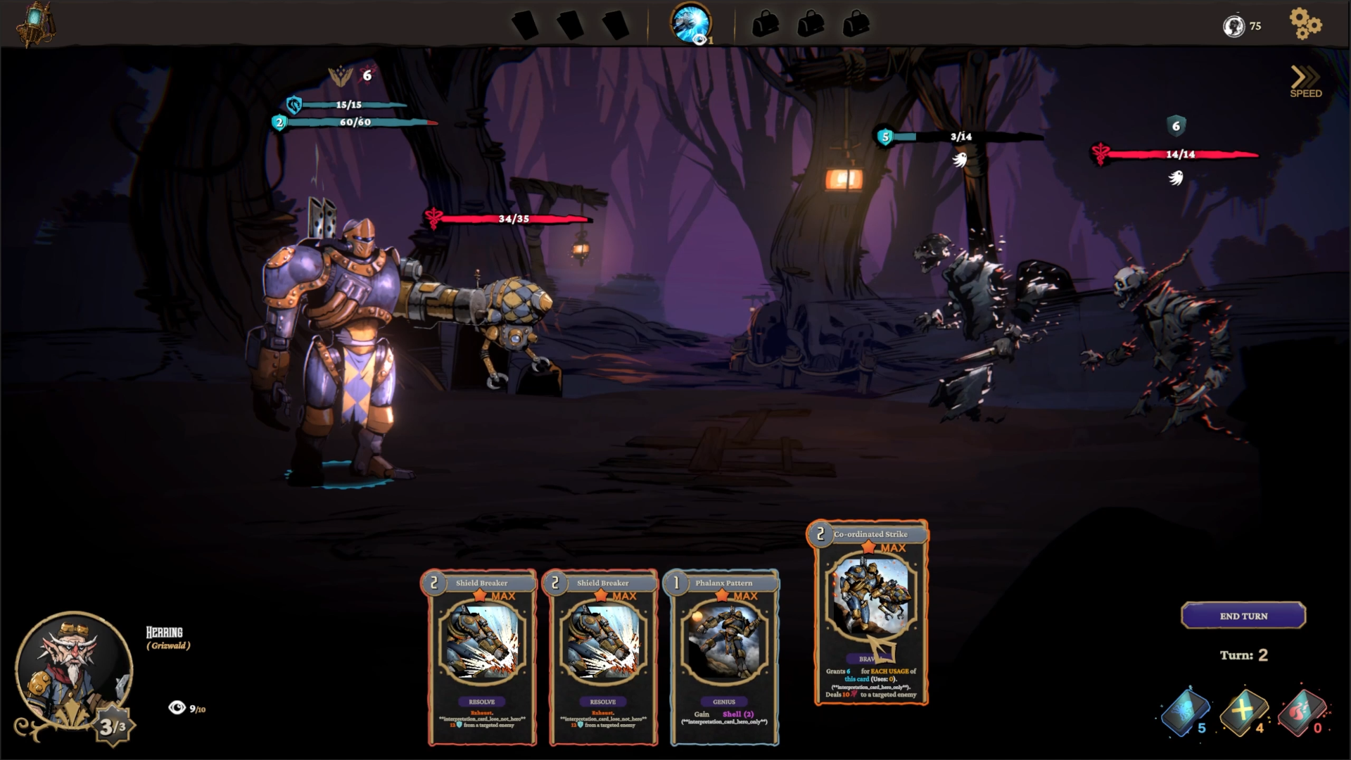
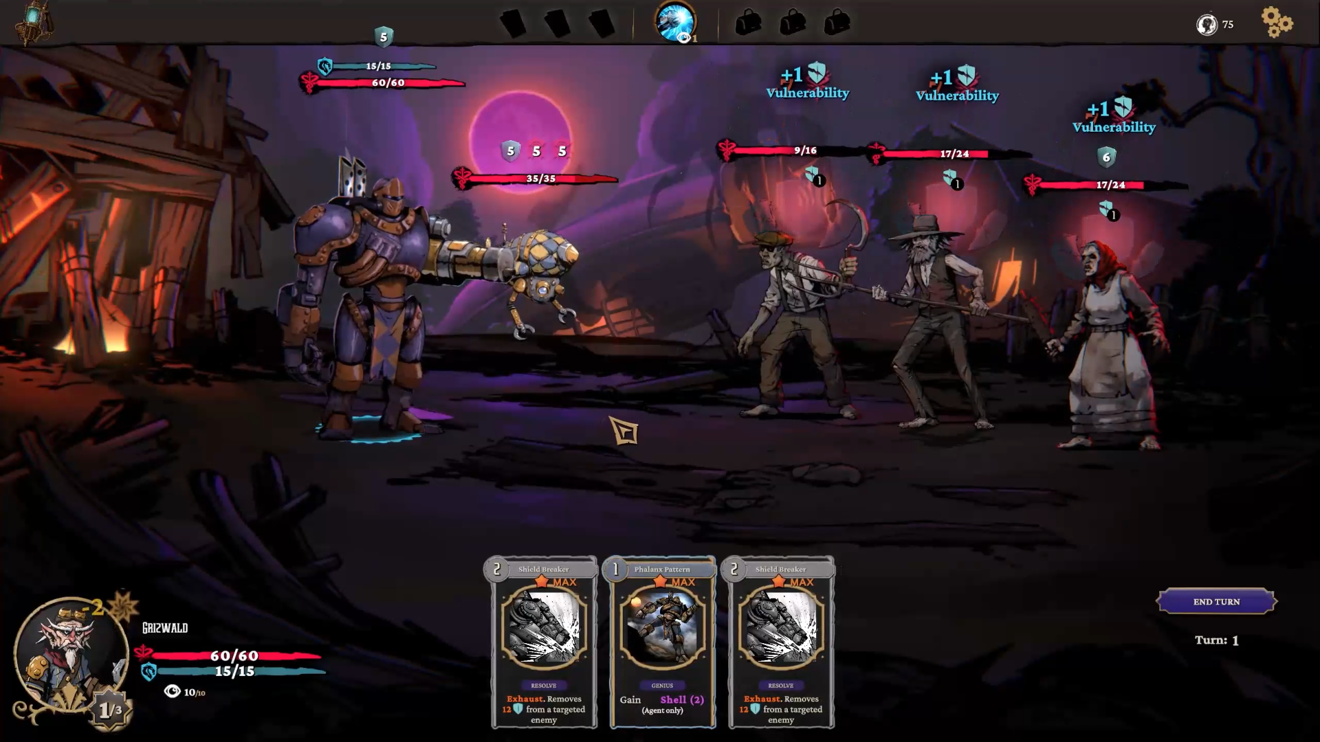
Dynamic Deck Building: Each agent has a unique set of cards. Craft your deck from hundreds of variations. Upgrade your cards to increase their power.
Turn-Based Combat: Hack, slash, and shoot your way through dark forests and winding streets. Battle dangerous creatures and formidable bosses. Learn their traits and tactics to best them in turn-based combat.
Roguelite Progression: Succeed at your mission, or retreat in failure. Either way, you’ll collect money, cards, items, relics, and salvaged materials. Use them to improve your agents, your airship, and your next run.
Discover Enchanting Tarot Cards: Modify your run by unlocking enchanted tarot cards. Combine their effects to improve your odds of success.
Contact for Further Information:
Isaac Otway
COO
E-mail: bizdev@zugalu.com
“Five More Minutes” Brings Nostalgic Gaming Journey to Kickstarter as a Roguelite Deckbuilder
Italian Indie Studio PurpleTurtle Creates Love Letter to 90s and Early 2000s Gaming Culture
EMBARGOED UNTIL OCTOBER 21, 8 AM EST
Gorizia, Italy – PurpleTurtle, an indie game development team from Italy, today launched their Kickstarter campaign for “Five More Minutes,” a roguelite deckbuilder set in the world of childhood videogames from the nineties to early 2000s.
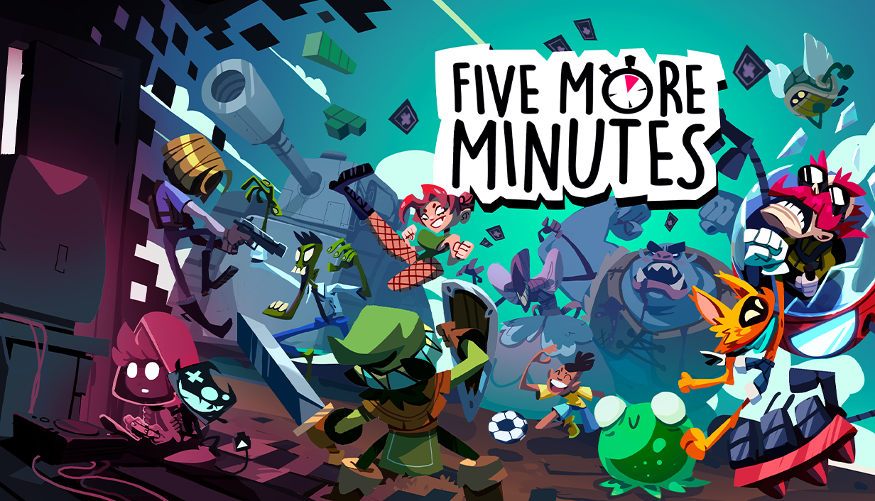
The game serves as a love letter to growing up with videogames, where players guide a young gamer through procedurally generated worlds inspired by different video game genres. Players choose from three starting characters – the Hero, the Cop, and the Mascot – each representing different gaming archetypes with distinctive playstyles and abilities.
“We wanted to create a game we would love to lose ourselves in,” said Matej Dornik, co-creator of Five More Minutes alongside Claudio Zeni. “The story is in many ways our story – the journey of a kid growing up with videogames as means of escapism.”
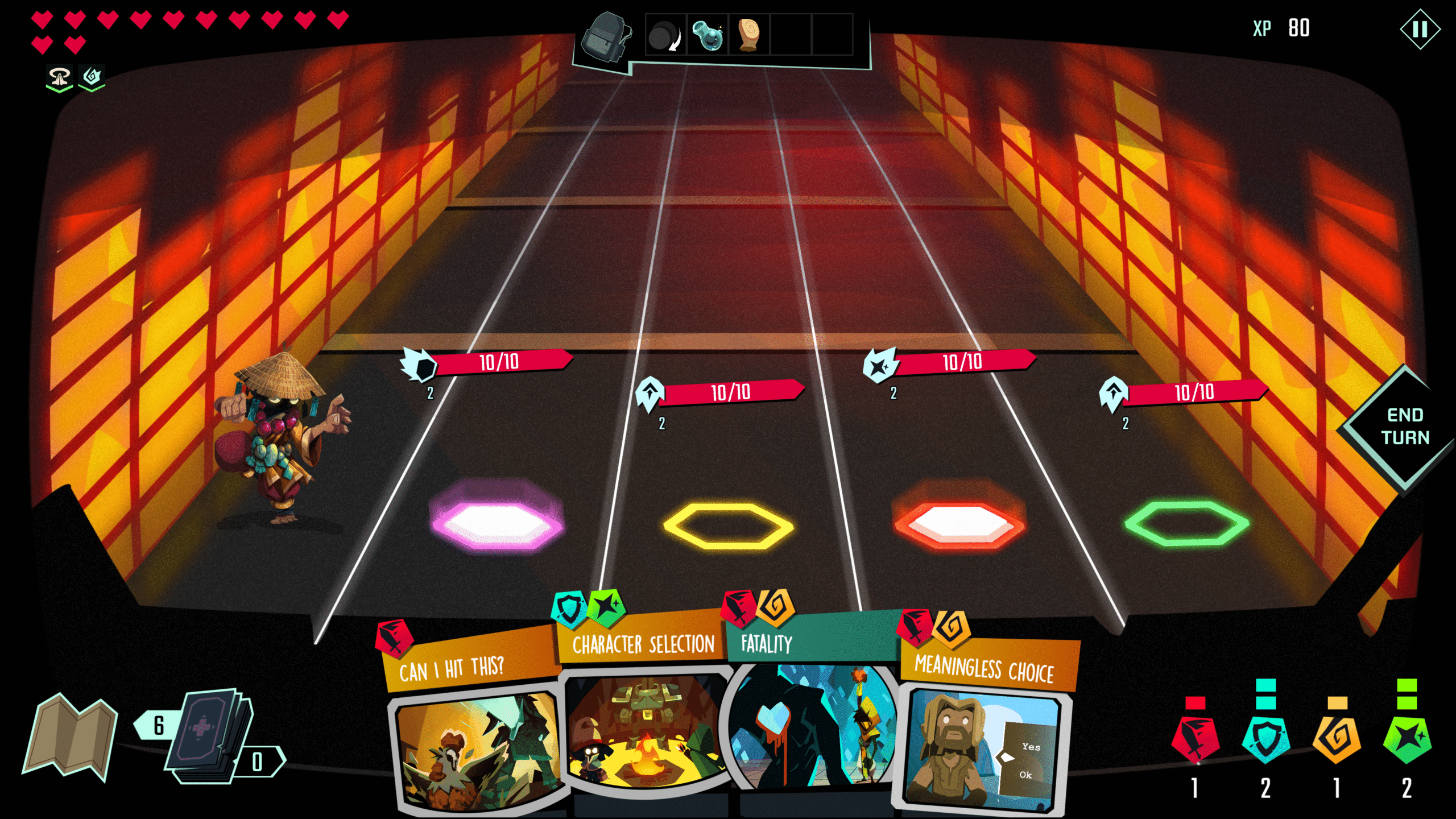
Players embody gaming archetypes from the resource management of the Horror Cop to the power-scaling of the RPG Hero and the agile movements of the Platformer Mascot. The game uses four unique button resources for different action types: attack, special attack, defense, and utility.
A mysterious “demon” character with a joystick-shaped head serves as the player’s guide throughout the journey, disguising as helpful figures while harboring a hidden agenda as the embodiment of video game addiction and the game’s secret final boss.
Key features include:
- Roguelite deckbuilder with procedurally generated levels ensuring unique playthroughs
- Three distinct starting characters with genre-specific abilities and playstyles
- Four-button resource system for attack, special attack, defense, and utility actions
- Character combination system allowing mixed card pools and deck building strategies
- Emotional narrative exploring gaming as escape and coping mechanism
- Cards and characters referencing classic gaming memories from the 90s and early 2000s
The Five More Minutes campaign seeks €10,000 in funding, and the game will launch on PC in 2026, with console versions planned. Early supporters can secure bonus content including a Steam key, digital soundtrack, and worldwide delivery.
The campaign is live now at: https://www.kickstarter.com/projects/purpleturtle/five-more-minutes
Contact: Matej Dornik, matej@purpleturtle.games
Press Kit: https://drive.google.com/drive/folders/1_aG-pJzCFPJ4tIZflMurwDz_FInPmW1a?usp=drive_link

Hunter’s Moon: A Sovereign Syndicate Adventure Heads to Steam Next Fest!
Hunter’s Moon: A Sovereign Syndicate Adventure is Featured in Steam Next Fest this week, including a demo now available on Steam. The game is coming soon for PC, Xbox Series X and S, Playstation 5, and Nintendo Switch 2.
Developed by Crimson Herring Studios and published by Zugalu Entertainment, Hunter’s Moon: A Sovereign Syndicate Adventure is a Victorian Steampunk Roguelike Deckbuilder set in the world of Sovereign Syndicate before the events of the first game. You choose from four characters with unique cards and abilities, customize your deck and character as you investigate a mysterious plague, and battle corrupted beasts and bosses in turn-based combat to unlock powerful relics and enchanted tarot cards. You’ll see some familiar faces, meet some new ones, and get to know more about the history of the Sovereign Syndicate and the world they call home.
Product Information:
Release Date: Q42025
Price: $19.99 USD, Steam Regional Pricing Adjustments, 10% Launch Discount
Steam: Steam Store Link
Target Platforms: PC, Xbox Series X and S, Playstation 5, Nintendo Switch 2
Announcement Trailer: https://www.youtube.com/watch?v=B-9Yk8-m2cY
Press Kit: Press Kit Dropbox Link
Website: https://zugalu.com/our-games/hunters-moon/
Features:
A Victorian Steampunk Fantasy Roguelike: A steampunk fantasy world awaits; filled with all manner of fell beasts and monstrosities. Something isn’t right here, the natural wildlife has been corrupted by a mysterious plague, and it’s up to you to discover the truth and find the cure; but no two runs are the same.
Rich Narrative Adventure: Return to the world of Sovereign Syndicate, before the events of the first game. Explore chilling encounters and complete missions as your agents investigate the Hunter’s Moon. Experience new locations, enemies and bosses across 4 chapters.
Four Unique Classes: How will you meet your challenges? A hulking brute that smashes everything in their path? A cunning soldier with weapons expertise? An alchemist with potions, poisons, and explosives? Choose your agent and build a deck that suits your playstyle.
Dynamic Deck Building: Each agent has a unique set of cards. Craft your deck from hundreds of variations. Upgrade your cards to increase their power.
Turn-Based Combat: Hack, slash, and shoot your way through dark forests and winding streets. Battle dangerous creatures and formidable bosses. Learn their traits and tactics to best them in turn-based combat.
Roguelite Progression: Succeed at your mission, or retreat in failure. Either way, you’ll collect money, cards, items, relics, and salvaged materials. Use them to improve your agents, your airship, and your next run.
Discover Enchanting Tarot Cards: Modify your run by unlocking enchanted tarot cards. Combine their effects to improve your odds of success.
Contact for Further Information:
Isaac Otway
COO
E-mail: bizdev@zugalu.com
